

1 Art Director & 1 Designer
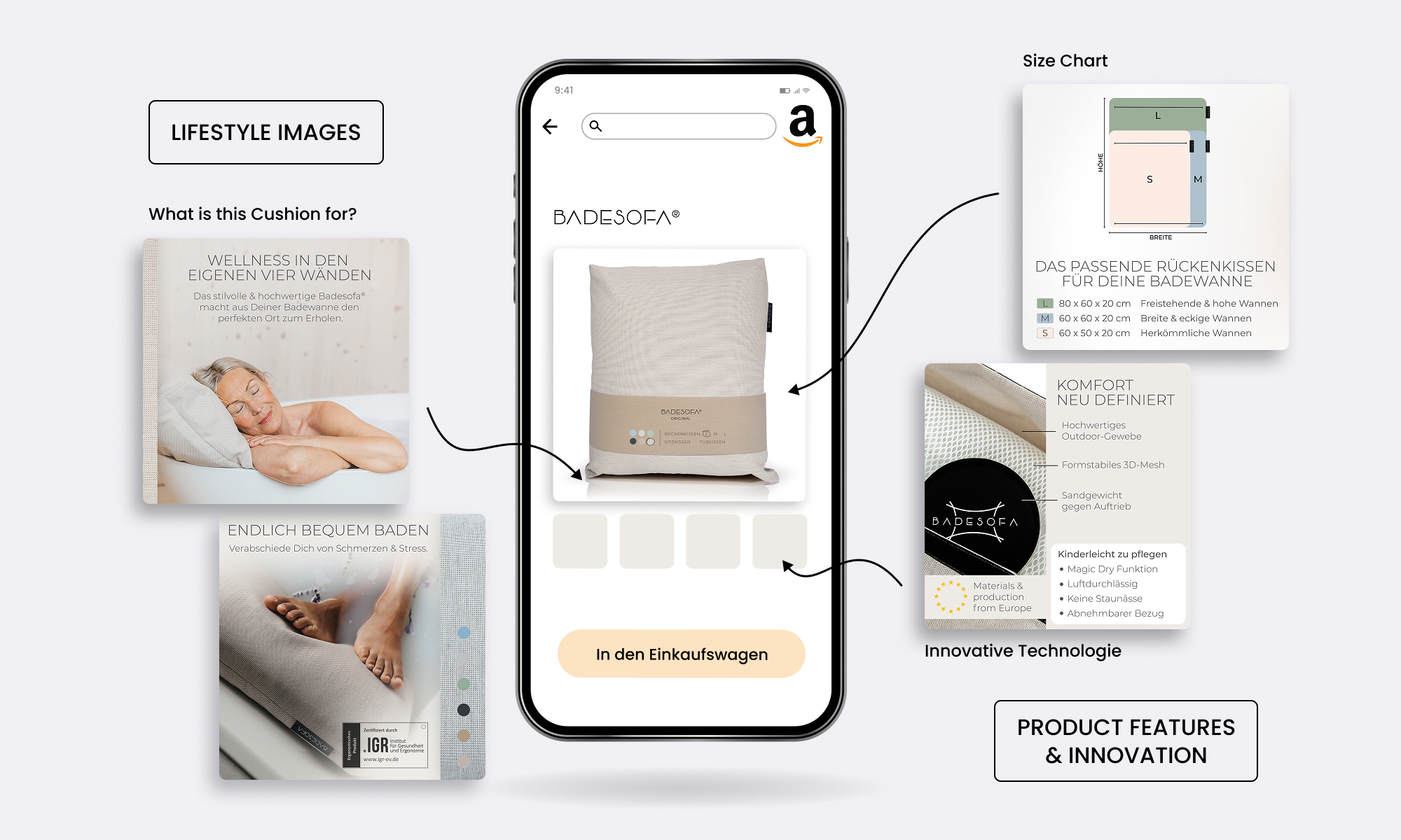
The central challenge was to communicate Badesofa’s innovation without overexplaining it. Users needed to immediately understand what the product is, while also emotionally connecting with the lifestyle it represents.
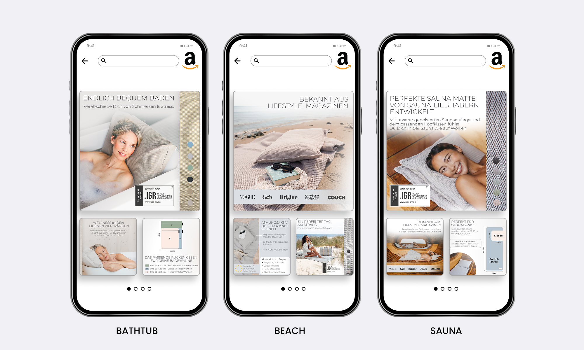
The visual direction therefore combines calm, aspirational lifestyle imagery with clear product depiction. This balance ensures that the product feels desirable and premium, while remaining easy to understand within Amazon’s fast-scanning context.
To support multiple product variations and future launches, I developed an image storytelling system that works modularly across listings. Core visual elements—composition, perspective, lighting, and typography—remain consistent, while individual details can be adapted per variant.
The system was also designed to be seasonally flexible. For example, during gift-driven periods such as Christmas or Mother’s Day, the images can be exchanged without breaking the overall brand consistency, because Badesofa puts great effort into regular photoshoots. This enables efficient content updates while maintaining recognition.
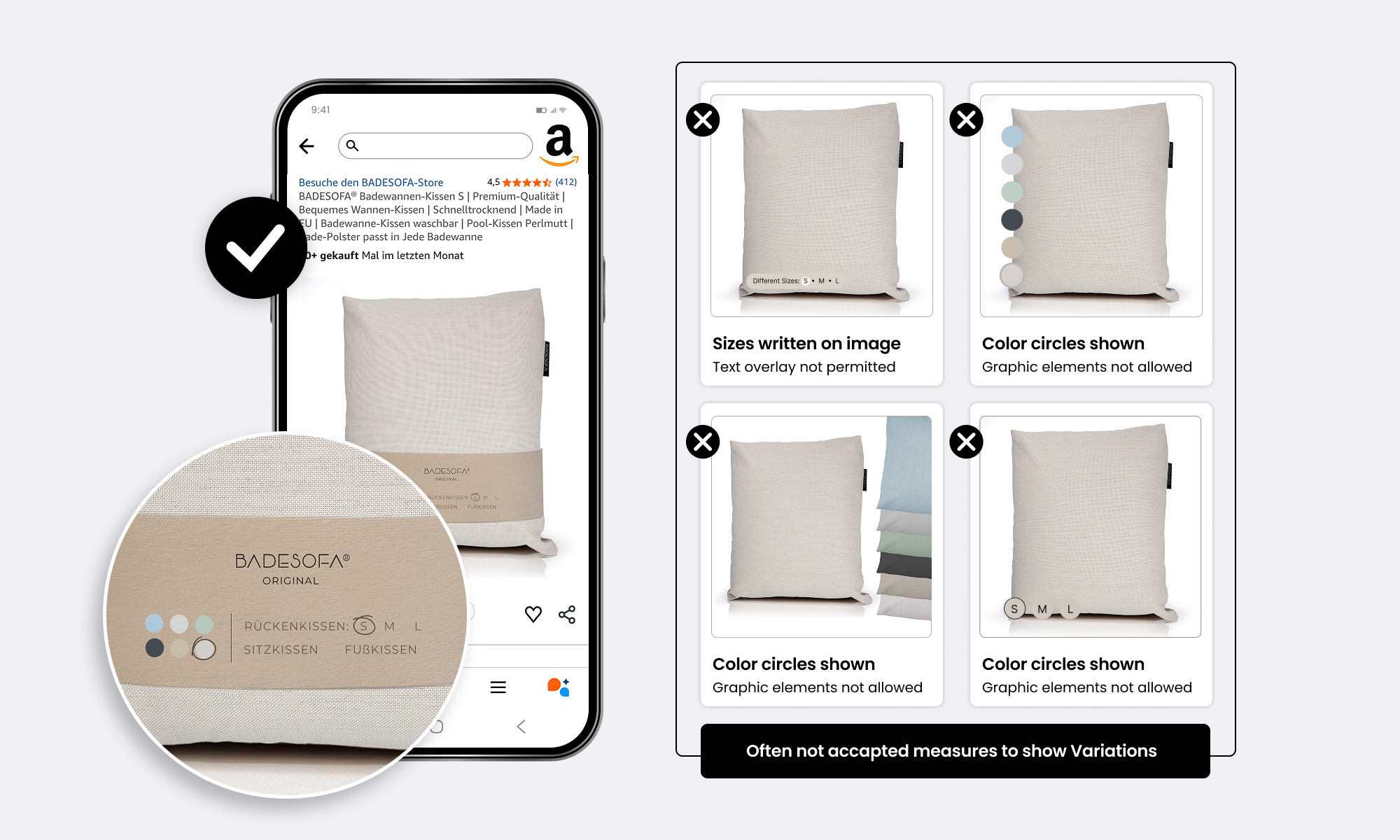
The main image strategy was designed to improve clarity and differentiation. A controlled banderole was introduced to communicate key product information at a glance, without obscuring the product itself.
This solution allows:
By standardizing the main image layout, the product becomes easier to recognize as the original and compare—supporting confident purchase decisions.
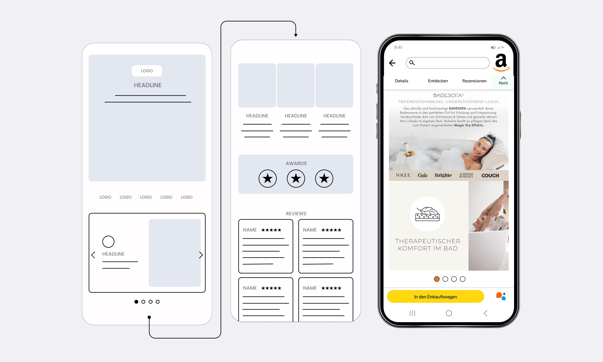
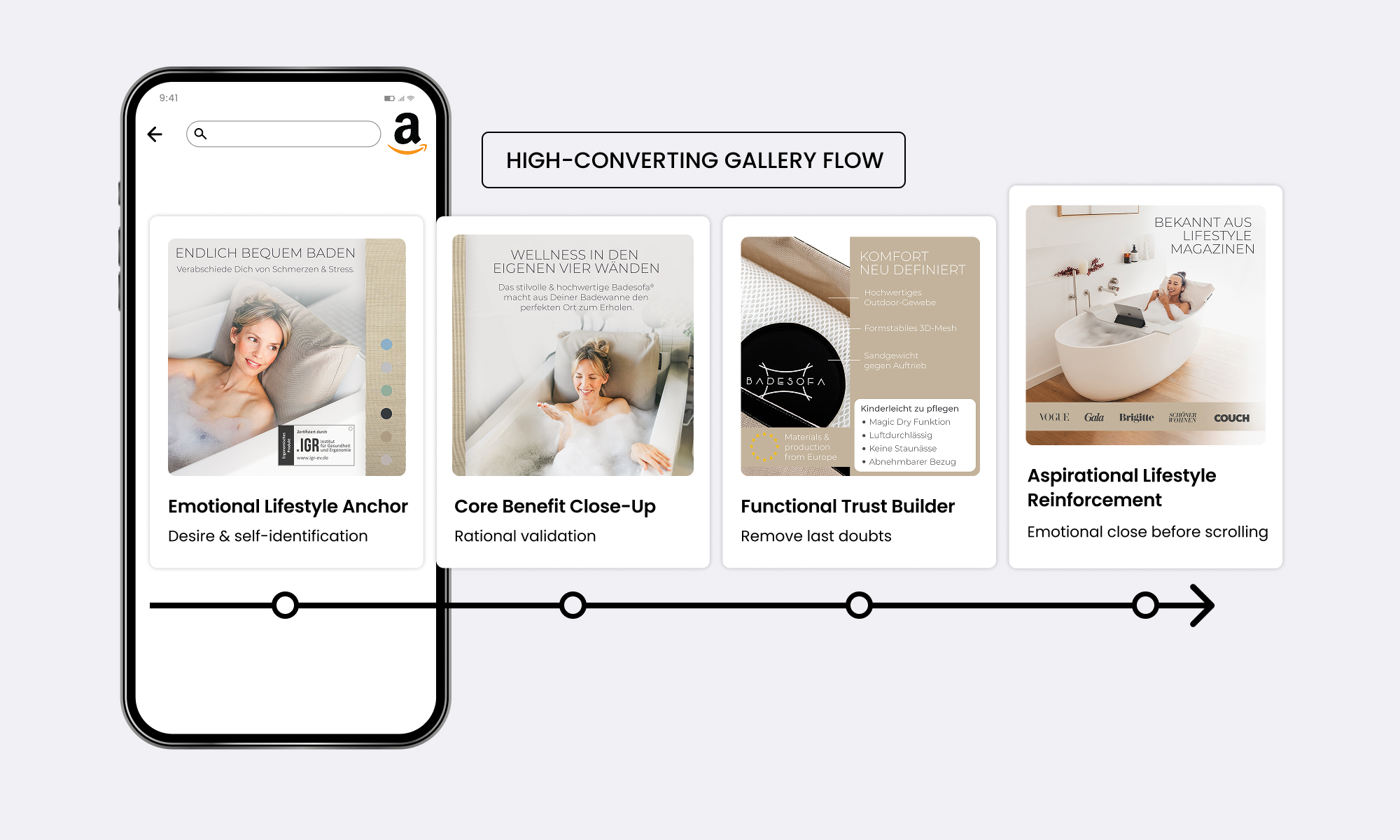
A+ Content was approached like a lightweight landing page rather than a traditional Amazon module collection. The layout relies heavily on white space, clear hierarchy, and calm pacing. Key elements include strong lifestyle visuals, social proof to build trust and reduced text blocks paired with aesthetic framing.
This approach creates a premium, editorial feel that supports comprehension and reinforces the product’s quality, while guiding users naturally through the content.
The Amazon redesign helped position Badesofa as a recognizable, emotionally driven Brand on the Amazon Marketplace in Europe and also the United States. The consistent visual system improves clarity across variations, while the A+ content strengthens trust and perceived value.
Key learnings from the project:
This project demonstrates how structured visual storytelling and system thinking can elevate everyday products into premium digital experiences on Amazon.
With today’s experience, I would further separate emotion and information. The gallery images would focus more on pure lifestyle and atmosphere, with less text and explanation, letting emotion drive the first impression. Functional details and product logic would live primarily in the A+ content, where users are more open to deeper information.
Additionally, I would place a stronger focus on seasonal campaigns, using targeted ads to lead into dedicated seasonal Store pages. This would allow the brand to better leverage key moments like gifting periods and tell more timely, emotionally relevant stories.
If you’re looking for a performance-focused designer who thinks beyond execution and integrates easily into existing teams, I’d be happy to hear from you.
Get in touch →