

1 Art Director &
Designer
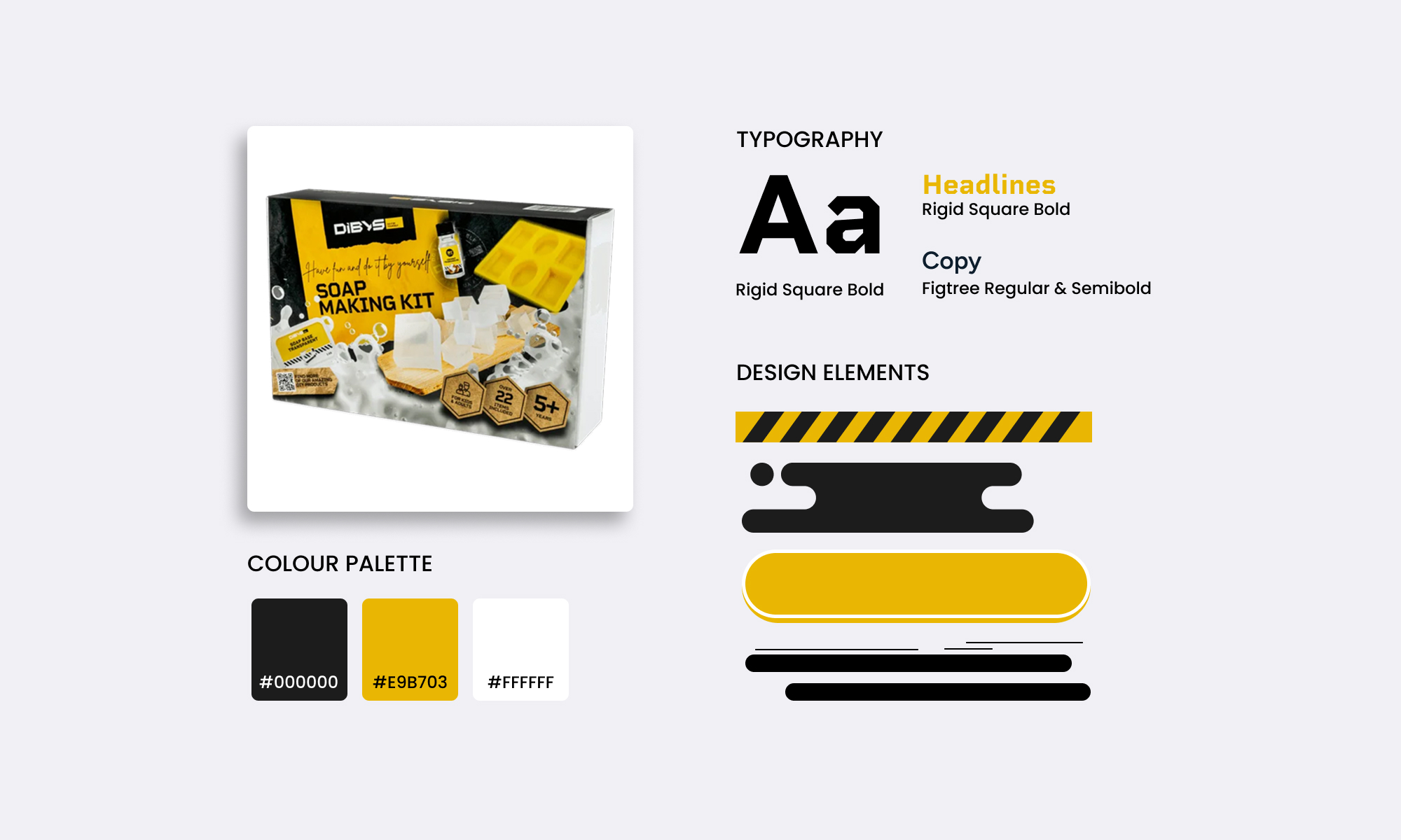
As DIBYS was new to Amazon, the first step was defining a visual style that could scale while staying closely connected to the product packaging. The color theme and playful brand tonality became the primary visual anchor for the listings, ensuring immediate recognition and a strong connection between online presentation and physical product.
Key visual elements such as typography, and illustrative cues were extracted from different packagings and translated into Amazon-compatible layout elements. This ensured emotional consistency while respecting Amazon’s UI constraints and competitive environment.
The result was a style that feels playful and creative, yet structured and clear enough to guide users quickly through product information.
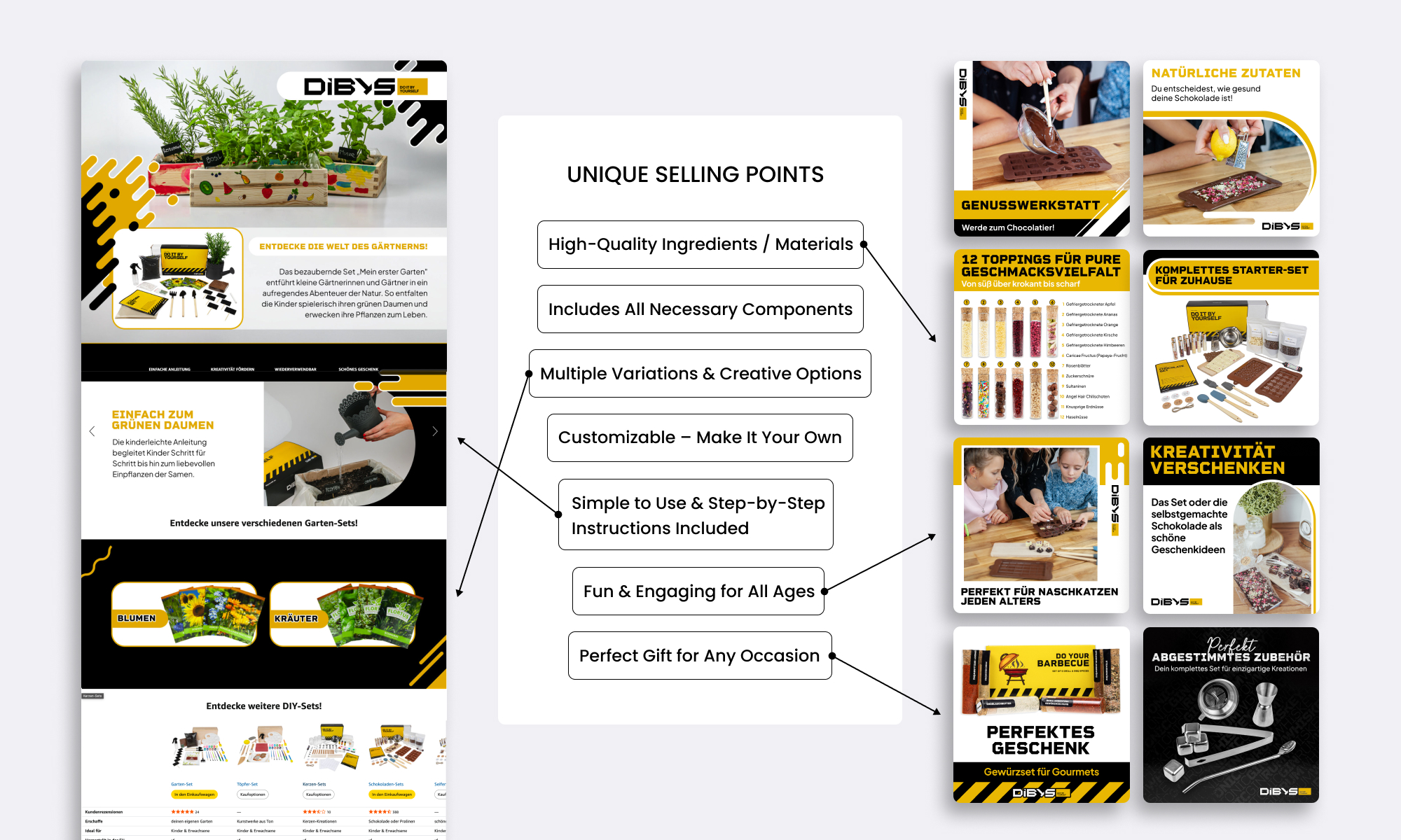
To support efficient scaling across products and categories, I defined a set of repeating USPs that could be reused consistently across listings and A+ content. Instead of reinventing messaging for every product, core benefit themes were established. These USPs were translated into modular content blocks, allowing new products to be launched faster while maintaining a consistent brand voice and visual logic. This approach reduced complexity in content production and strengthened recognition across the catalog.

A+ Content was treated as a structured user journey rather than a collection of visual assets. The goal was to guide users logically through discovery, understanding, and reassurance—regardless of product category.
The framework follows a repeatable structure that answers key user questions:
By standardizing this flow, A+ layouts could be reused and adapted across multiple products while still allowing category-specific highlights. This UX-first approach improves orientation, reduces cognitive load, and supports confident purchase decisions.
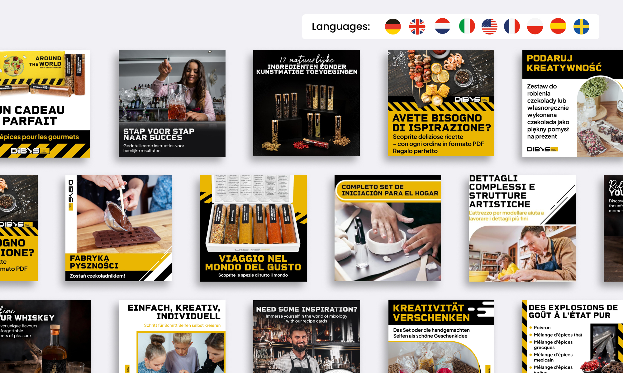
A key challenge was international scalability. The brand launched in multiple markets, requiring consistent design across nine languages.
To achieve this, I established an automated translation workflow:
This process enabled the rapid creation of hundreds of language variants, for full gallery sets of 6 images each, while maintaining visual consistency and typographic integrity. It significantly reduced manual effort and minimized the risk of translation errors across markets.
The Amazon launch established DIBYS as a recognizable and consistent brand from day one. Multiple product categories were successfully introduced within the first months, supported by a scalable design system and structured user experiences. The brand achieved stable sales performance and positive customer feedback across markets.
Looking back, the project reinforced several key learnings:
This project demonstrates how system thinking, UX strategy, and automation can work together to build brands efficiently in complex, fast-moving marketplace environments.
If you’re looking for a performance-focused designer who thinks beyond execution and integrates easily into existing teams, I’d be happy to hear from you.
Get in touch →