

1 Art Director,
1 Designer
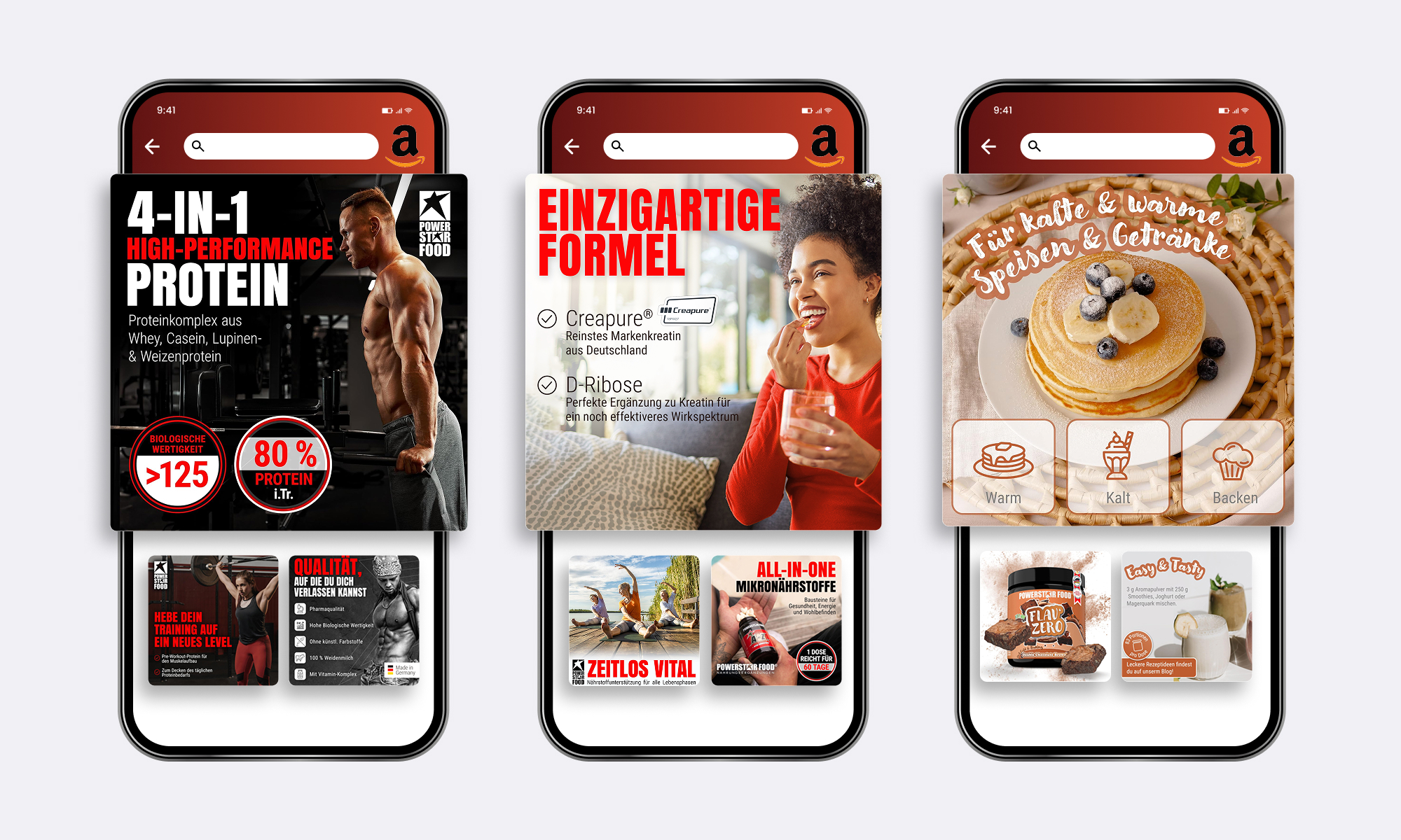
The first step was shaping a design strategy that could unify a wide and diverse product assortment. Each product group targeted different needs, yet the brand required a cohesive presence. I formed three visual archetypes that addressed specific user motivations:
This segmentation ensured flexibility while maintaining recognizability across the Amazon ecosystem. It also turned the catalog into a system rather than disconnected products—important for both brand equity and user comprehension.
Since Amazon listings function like micro-UX environments, the design solution had to support fast scanning and simple decision-making. Users rarely read blocks of text, especially in supplements; instead they search for reassurance, clarity and immediate benefits.
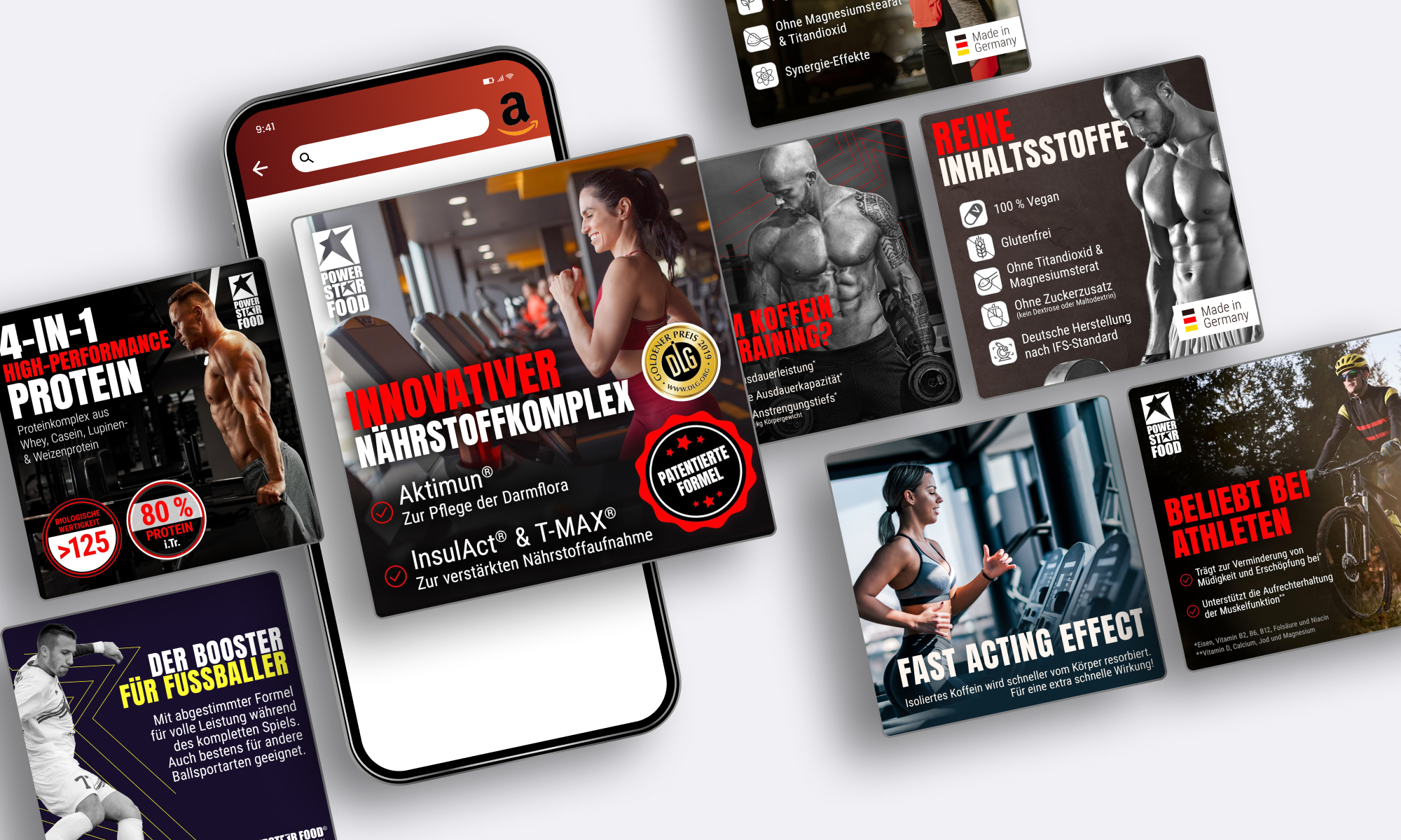
I defined a universal set of mixable promise blocks: key nutrients and ingredients, assurance icons translating the brands attribute for high quality ingredients, usage expectations like dosage rhythm, lifestyle scenarios reflecting real user routines, category-specific social proof and emotional everyday health benefits. The goal was to create mix-and-match building blocks that feel consistent, but adapt to the needs of each product and user mindset—guiding customers to confidence faster.
The A/B test on the main image confirmed this approach. The version featuring a flavor icon improved CTR significantly—supporting the insight that users react strongly to clarity and immediate product identification.
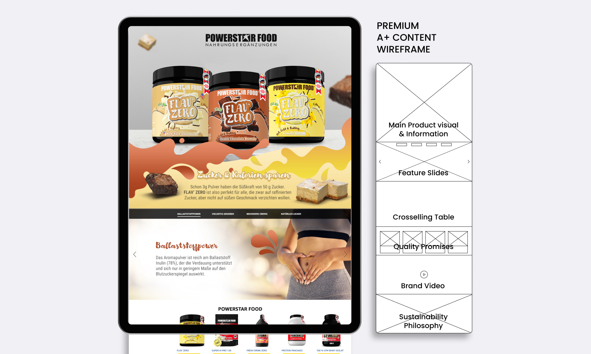
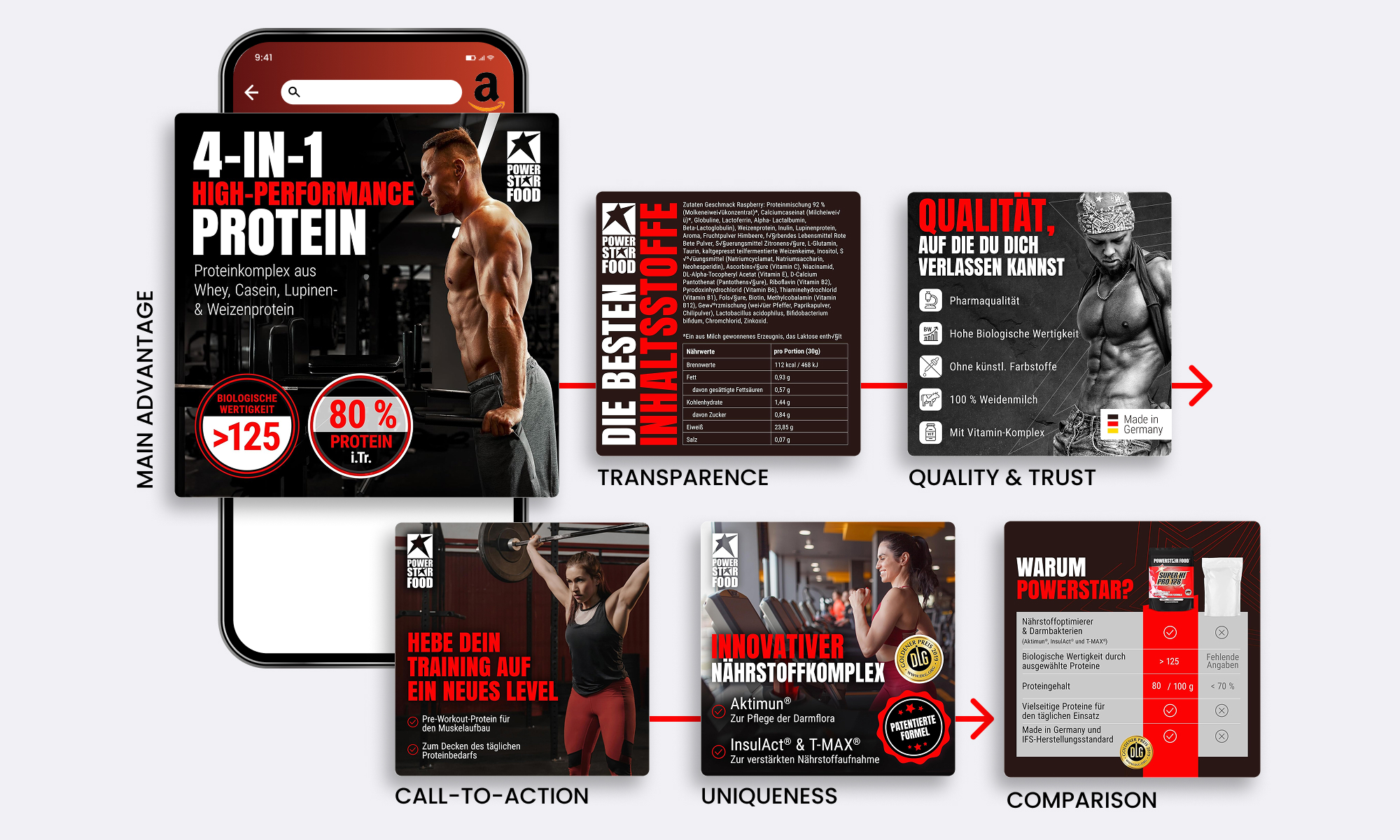
A+ Content often becomes text-heavy and overwhelming. Instead, I approached it like a lightweight landing page with progressive disclosure. Including product specific information, crosselling and brand philosophies. Each product module solves a user question, guiding customers step-by-step. Depending on the product some of these questions can be:
This structure reduced friction and gave each product a distinct yet familiar rhythm. Even within brand constraints, this UX-first flow increased clarity, trust and perceived quality.
The videos were created for Amazon PPC and launched simultaneously with the visual listing redesign. Because the product is already displayed next to the video in Amazon’s interface, we intentionally avoided repeating it. Instead, the opening seconds use oversized headlines and high-impact motion to stop the scroll—functioning more like a digital billboard than a product demo.
Rather than explaining ingredients or usage, the videos focus entirely on emotion: high-energy workout intensity, power and momentum. This direction reflects the mindset of performance-driven users and aims to convert through aspiration and feeling, not information. These are pure advertising assets—built to grab attention first, spark interest instantly, and drive emotional conversion in a fast-scroll PPC environment.
Stock footage and motion elements replaced missing imagery while maintaining consistency across product groups. The result was a set of short, functional ads that supported the listings rather than distracting from them.
The redesign significantly strengthened the brand’s Amazon performance: product recognition became clearer, user decision-making more intuitive and trust signals more consistent. The results—three times higher gross margin and three times the channel profit—highlight how a coherent visual system can influence both perception and conversion.
Looking back, if I would do this project again, I would expand the video A/B tests to include a full 45-second storytelling format, exploring a narrative from daily life to training—an office worker using supplements for general health, evolving into a gym routine that fuels performance. I also would have introduced a dedicated product-focused photoshoot to show real usage moments, adding human context and relatability. Finally, I’d test a more natural and holistic visual direction for one general health supplement, leaning further into a healthy lifestyle aesthetic while strengthening the brand’s iconic star as a recurring visual anchor.
These reflections underline the learning that performance design benefits from both systemic consistency and controlled experimentation, especially in an environment as fast-moving and competitive as Amazon.
If you’re looking for a performance-focused designer who thinks beyond execution and integrates easily into existing teams, I’d be happy to hear from you.
Get in touch →